Wednesday, 30 November 2011
Thursday, 24 November 2011
Tuesday, 22 November 2011
Thumbnails - Room Of Roots
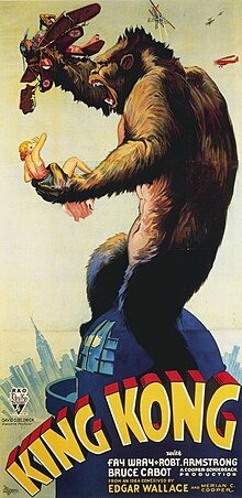
King Kong Review
 |
| Fig. 1 King Kong poster |
 |
| Fig. 2 King Kong bound |
Starting on a high, the tropical island's scenery is a focus point for the creativity of the film. The stop motion battle sequence of Kong and the dinosaur is a spectacle, regardless of the film's age, though it may seem more comedic now than when it first came out. The basis of the film lies entirely upon a puppet, which may seem a hefty task, but has warranted the film a remake. As John A. Nesbit said, "While difficult to conceive that a small "puppet" in the gigantic title role could carry the movie, that's what O'Brien achieves" (Nesbit, 2005). The reference to O'Brien is to the special effects designer, Willis O'Brien.
On a lower note, the story takes the backseat when introduced to the islands inhabitants. Apparently the word 'stealth' didn't exist in 1933, with the boarding party standing in the open oblivious to the consequences with the additional 'they've seen us' comment from the director who set up his tripod camera. And as to when Kong is bound on stage with an audience of people observing, you would expect the 'eighth wonder of the world' to have some sort of police presence, unless they thought a gigantic ape that had previously killed a dinosaur, killed most of the crew of the ship and fought off a raptor, posed no threat.
 |
| Fig. 3 King Kong fighting jets |
King Kong is "purely an exhibition of studio and camera technology-- and it isn't much more than that" (Bigelow, 1933). Willis O'Brien has captured the motion and emotion of Kong, standing as the highlight of the film, with the build up to Kong's appearance serving it's purpose well.
Illustration list
Figure 1. Ernest B. Schoedsack (1933) King Kong poster. At: http://upload.wikimedia.org/wikipedia/commons/thumb/f/f3/Kingkongposter.jpg/220px-Kingkongposter.jpg
Figure 2. Ernest B. Schoedsack (1933) King Kong bound. At: http://chosis.coldfusionvideo.com/wp-content/uploads/2011/03/king-kong-33_12.jpg
Figure 3. Ernest B. Schoedsack (1933) King Kong fighting jets. At: http://theronneel.com/wordpress/wp-content/uploads/2010/05/Get-em-Kong3.jpg
Bibliography list
John A. Nesbit (2005) Old School Reviews. At: http://oldschoolreviews.com/rev_30/king_kong_1933.htm
Kim Newman (2005) Empire. At: http://www.empireonline.com/reviews/reviewcomplete.asp?DVDID=116908
Joe Bigelow (2007) Variety. At: http://www.variety.com/review/VE1117792322?refcatid=31
Monday, 21 November 2011
Room Of Roots - Progression
Filling out more around the canvas, increasing the lighting from the windows on the left and right as well as adding a dark textured brush to the wall behind the roots and vines.
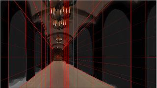
After speaking with Photoshop Phil, I enlarged the size of the canvas, pinpointed the perspective point and altered the lighting on the stairway.
I began sketching and blocking out the structure around the centre piece.
I then flipped the image to see what was and wasn't woking, noting the right hand side is too dark.
A lot of texture is placed over the top with a light tone in the upper left section, where I would later add a light source.
Finishing off most of the textures, I then began blocking out the background for the stone wall pattern.
Finally finishing off the textures, I then added a quick layer over the top, darken the edges and showing a predominate light source that highlights the centre piece more. Open to feedback, Kadeem, Freddie and Phil, all pointed out the lighting was too strong, covered too much area and the edges were too dark, losing the texture of the whole scene.
During the photoshop session, Phil helped me alter the layer that was obstructing the scene, changing the grey lighting to a grey blue. I reshaped some portions that had lost their structure when I was applying the texture, and created a new layer over the scene, but underneath the lighting. I unintentionally changed the layer from normal to colour dodge, and worked into it unaware. The colour dodge tool helped highlight sections without becoming too apparent.
Room Of Roots - Edit
Altered the lighting by adding a bit blue to get a cooler feeling, added a bit more texture and used a colour dodge layer to highlight sections.
Sunday, 20 November 2011
Final Piece - Room Of Roots
The first of my final pieces, the Room Of Roots. I'll most likely edit it after the photoshop session, but this is more or less finished in my eyes. I welcome any, and all, feedback and criticism.
Life Drawing
Three sessions worth of life drawing, varying from two minute poses to half an hour poses to a hour and a half pose.
Subscribe to:
Posts (Atom)


